Every tool has a ceiling. Most of the time the ceiling is high enough that you never notice it. When you do notice it — when you hit the exact edge of what the software will let you do — you have a choice: redesign what you want, or redesign the tool.
This is a story about the second option.
Essential Elements was due for a change. The existing brand had drifted somewhere it never quite belonged — dark, high-contrast, aggressive. It worked for a certain kind of supplement buyer. Not for ours.
The brief that emerged from the pivot was essentially the opposite: earthy, rich, tactile. Something that felt like it belonged on the counter of someone who actually cooks, who cares about their body without making it a whole personality. Everyman functional fitness, not crossfit gym bro.
That’s a big shift in color language. Warm, complex hues with real depth. Colors that feel grown — not grabbed off a brand palette wheel.
But there was a catch: this wasn’t supposed to be a clean break. Stakeholders wanted evolution, not reinvention. The new palette had to feel continuous with what already existed — related, not replaced. Same family. Different branch.
That constraint made this a threading-the-needle problem. I wasn’t anchoring from scratch. I was anchoring from specific existing hues that already carried relationships, and I needed to find new colors that were harmonically connected to those hues while also reading warmer, richer, more grounded. The destination was specific. The path to it was narrow.
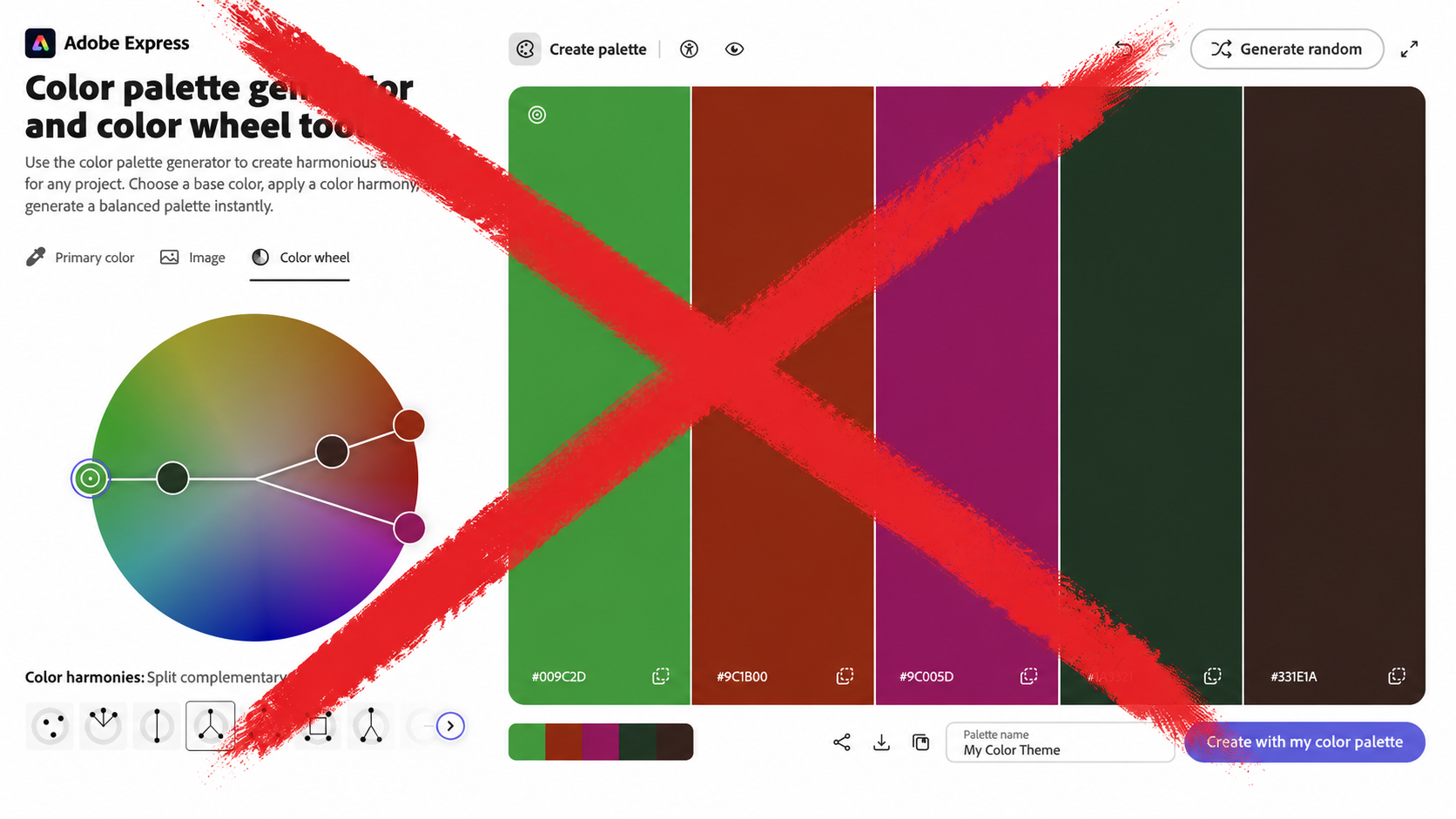
Split complement is one of those color relationships that’s almost too useful. You anchor on a dominant hue, then find two colors on either side of its complement — offset by a set angle. The tension it creates is sophisticated without being chaotic. It reads as intentional.
The problem: Adobe Color’s split complement scheme locks the angle. It lives at roughly 30 degrees on each side of the 180-degree complement — and that’s it. You can spin the wheel all day. The geometry doesn’t change.
For a lot of projects, that’s fine. The fixed angle gives you a safe, balanced result.
For this one, it wasn’t enough. Adobe Color’s fixed angle doesn’t know what palette it’s evolving from. It doesn’t know that I needed the new colors to feel harmonically related to specific existing hues — that the angle had to be exactly right to sit in the overlap between “continuous with what’s there” and “warm enough to signal something new.” That’s not a general problem. It’s a precise one. And a fixed slider solves a general problem.
I needed to move the angle. Adobe Color would not move the angle.
That’s the ceiling.
At some point, frustration stopped being useful and started being information. The information was: this is a tool problem, not a vision problem. The vision is fine. The tool can’t reach it.
So instead of adjusting what I was looking for, I built something that could find it.
Using Google Gemini App Builder, I described exactly what I needed: a color tool that takes a base hue and generates a split-complement palette, but with a slider controlling the split angle — anywhere from near-zero (almost pure complement) to 60+ degrees (approaching square palette territory). No locked geometry. Full range.
What came back was a working prototype. Not pretty and polished, but a tool I was able to quickly to create to get my work done better and faster. I could drop in a hue value, slide the angle, and watch the palette shift in real time. The relationships I’d been chasing — the specific warmth, the way the supporting hues sat against the anchor — became explorable instead of imagined.

It’s not magic. It’s just giving yourself the actual instrument you need.
I've since made some refinements. You can try the latest version here.
With the angle free to move, I found the palette territory pretty quickly. Not because the tool did the creative work — it didn’t. But it stopped making me argue with geometry when I should have been looking at color.
The resulting palette reads warm without being autumnal, grounded without being drab. The split angle sits in a range that Adobe Color doesn’t expose. That specificity matters. A few degrees in the wrong direction and the whole thing softens into something forgettable.
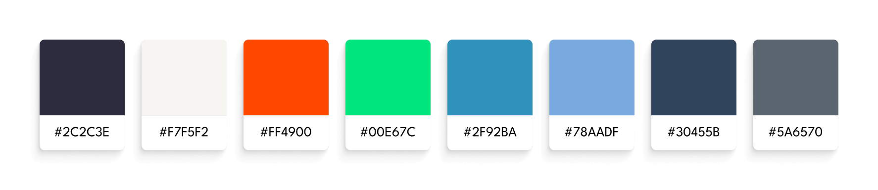
The palette has been approved internally and is in a test phase now. But honestly, I knew it was right before any of that. You know when something you’ve made is actually finished.
The ceiling I hit was a small one. A locked slider in a color tool. The tool I built to get around it took a few hours and may never be used again in exactly that form.
But the pattern it represents isn’t small.
The tools available to designers right now are changing faster than most design processes are. That gap between what’s newly possible and how people are still working is either a threat or an opportunity, depending on how you hold it. My instinct is to hold it as an opportunity — to keep scanning the horizon, pick up what’s shifting, and figure out how to put it to work without waiting for a memo to come down.
AI is genuinely scary for a lot of designers. I understand why. But the way I see it, there’s a beast in the room. You can learn to ride it, or you can wait for it to eat you.
I’m learning to ride it. And honestly — riding scary things is pretty fun.
I’m drawn to strange questions, bold ideas, and the edges of what’s possible. If you’re here to make meaning—or make something beautiful—drop me a line. Don’t be shy. Let’s make something weird and wonderful.